
November 1917, the Bolsheviks overthrew the regime, they were the working class. No longer happy with the rule of the rich and elite Tsar. Lenin was their revolutionary, leader of the Russian SFSR. The below film depicts the invasion of the winter palace in Petrograd, it marks a crucial turning point in the revolution and Russian history. The film was produced to celebrate the revolution and victory, a decade later. [1927]
'Peace, Bread, Land'

With 80% illiteracy, visual communication was incredibly important, you can't spread a message if your audience can't read it. Visual communication became key to spreading the spirit. Red became a signifier for the 8 million dead and their blood spilt to bring about the revolution, and the victory over the tsar. A colour used throughout a lot of Russian iconography and on the flag. White became the colour of the the rich and the tsar. So below the working man carries the red flag through the buildings of the Petrograd where the buildings all covered in white. Red is the repression and the slain revolutionaries.

New start, new art. The Bolsheviks brought about new their own new identity and visual language, one suited for the working class. With a huge emphasis on symbolism key on their new visual language. It's uniquely Russian and speaks about their lives. From 3rd world to a new and culturally progressive powerhouse. Early Russian modernism, it displays the workers experience, in factories. It was mechanical and industrial, and incredibly unique.

Lenin encouraged the avant-garde artists to look west to artist's like: Picasso and Matisse, and to learn from them. Art in Russian was become geometric and industrial. It was organically developing into it's own style. This wouldn't have happened without the revolution.

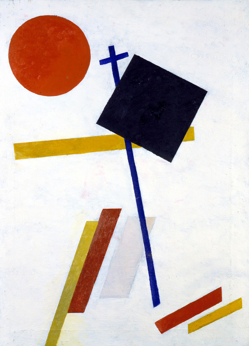
El Lissitzky - 'Beat the whites with the Red wedge'.
This poster marks the moment of revolution using pure visual communication. Representing the workers as the red wedge vanguard, and the elite as the white circle. A re-enactment of the storming of the winter palace in Petrograd.

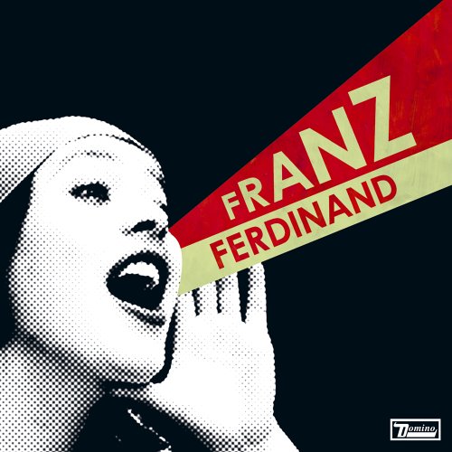
'Books' by Rodchenko was created to try and get people reading more by been placed outside of libarys. With no art market all design was been made to an agenda and have a purpose, one suited for the working class. Using common iconography, circle and wedge, subtly placed centre. 100 years old and still looking fresh, the influence the work been made still can be seen today. Example here been the cover for Franz Ferdinand's album cover, it's simple and has dated incredibly well. Also seen in the poster is the fact that it's a woman that's front and centre, the revolution was a leftist movement, socialistic and this is felt throughout the design and art.

Powerful and vocal iconography at it's best, another of Rodchenko's posters, here seen is Lenin building the new. The revolutionary himself, shown atop the wedge and circle, carrying infrastructure. Implying he's building the new on top of the old (the circle). The technique used was also revolutionary, photo-montage was a new thing, it was real and objective.

The aim of constructivists was 'of achieving the communistic expression of material structures'. ('The programme of the first working group of Constructivists' 1921 quoted in Lodder (1983) Russian Constructivism, London & Yale, p.94)
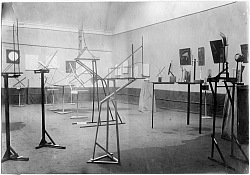
The constructivists also experimented with architecture, it was radical and new designs. Shown below is a test space for the new progressive designs rather then a exhibition of them. They were ambitious and where to show the true power of what Russia had become.

No comments:
Post a Comment