To find out about each other we did a quick questionnaire to get to grips to know each others personalities, I thought it was really quite cool to design a typeface around someone so I needed alot to work from to be able to do this.
I wanted Daisy to write down her hand writing in capitals and in lowercase so I could get an idea of how her gestures appear in both cases, I really liked her handwriting at first sight. It's feminine, curved and it felt playful in it's mannerisms. I took this as one starting point, thinking it would be rather personalized as well. Her favorite medium to work with was fine liners she's plain and simple, but over the top and easy to get along with. I think It'd be really suitable to go with this.
As for her interests within television she was really into the following programs below:
However I don't really think of many of the typefaces used for these programs would really reflect Daisy enough to be able to establish the link between her and it, she liked Numa bar, a negative space artist.
I have to admit, I'm quite fond of these my self so I would like to see how this could be incorporated in with the typeface.
In a film of her life, Reece Withaspoon would play her, and Ryan Renolds would be invited to her dream dinner party. Minnie mouse been her costume of choice when it comes to fancy dress.
I really enjoy a piece of design that builds on reference points like these, it's witty and humorous in a sense that they're making such a connection with something we cherish, to something we blow our nose on. It's a good move, on the wording as well, they discarded the gender from the saying and made it a universal thing one, but the pont is still been made through the visual. It takes a lot more thinking to get something like this nailed down and they executed it really well and that's why I like it.
As part of a series, in a similar style in a school setting. They made the type exist physically. Instead of digitally overlaying it, they opted to physically create the typography in the picture. Using perspective to create it, It's incredibly effective and executed. Once you see the other it invokes curiosity again in how they've actually made it. I don't often like these but simply for how well this one has been done and how effective it is, It draws me to like it.
Graphic Design I Dislike:
David Carson's work mostly irritates me, along with other similar Post-modern grunge work. I want to see a poster, book cover, etc, that's going to give me information or if it's advertisements, influence me. But because it's illegible, you can make out some words, but for the most part you can't because of the overlays it makes it frustrating to try and figure out what it's trying to say. Apart from been a collage of everything and anything, it just makes me dislike it.
It's cheap and tacky, you can see someone's made this on cheap instead of hiring a Graphic designer to do the work for them. Who would provide more effective results instead of wasting printer ink, they'd also receive more effective results. It's obvious what's bad with it, the overload of information, the grungy illegible typeface and clashing colours. It's not effective in what it's trying to do and I don't think they've attempted to think about that aside from the grungy typeface.
Layout
Colour
Context
Visual content
Non-visual content
Function
Concept
Composition
Legibility
Communication
Visual Quality
DIET
Describe, what you see.
Interpret, what it is.
Evaluate, what's good about it.
Theorise, how it can be improved.
Kleenex Ad
Describe
An Advertisement for Kleenex's pocket pack tissues.
Origami Style dog, moulded from a tissue.
Explained with the tagline. 'Your best friend' - References the Man & dog relationship.
Basic and layout, simple in delivery.
Interpret
Advertising for a product that doesn't have much glamour
Speaks to both men and women, colours and drawing attend to both.
Drawn diagonally down across the advert, no distractions.
Shaped to be the same as a Kleenex.
Evaluate
Effective and understandable, accessible to everyone in it's message.
Difficult product to advertise, yet how it's done is with subtly.
It's appealing to both genders.
Simple diagonal flow, easy on the eye but stands out.
Theorise
Nothing obvious need's changing, perhaps altering the drawing to be a bit more gender neutral.
Bridging the Gap poster
Describe
Nightclub Poster from London. 'Bridging the Gap'
Event details displayed: price, place time and links to sites to the DJ's who are playing.
Bright and bold geometric pattern, 3 bright contrasting colours.
Broken up information, details all over the place.
Interpret
Typography is legible, communicates well when it's found.
The organisation of the layout is organised, but it's broken up too much and is a bit overwhelming.
Reminiscent of the Swiss-style in layout, lots of grid usage.
Evaluate
Strong colours grab your attention, too much but it's effective.
Image is too strong of a part in the poster that it draws too much attention to it's self.
A lot of websites on the poster, a lot with the rest it's bombardment of information.
A bring back to older night-club design posters. (Peter Saville)
Theorise
Pulling back the very strong colour combination, reducing the potency of the pattern.
Rearrange the information to flow a lot better, and flow well instead of breaking it all off.
Five Reasons Critical Analysis is useful:
It gives you a greater understanding of the different types of Graphic design.
Helps you understand what has made work successful and unsuccessful.
Gives you an understanding to judge work better.
Analysing other peoples work helps give you a understanding how you're work is viewed.
Gives you an understanding of graphic design.
Five Reasons Crits are useful:
Brings up ideas you wouldn't have thought about otherwise.
People's judgement helps shape your work for the better.
Useful in seeing everyone else's work to see where you are at.
Encourage you to produce better work for the next crit.
Gaining an idea of what does an doesn't work.
What Affects my Judgement of Work:
Layout
I like layout that creates flow to the work and helps direct me to the information I want to read, unlike for example David Carson's work which is a jumble of information and makes looking at it a chore.
Concept
I have a big appreciation for smart concepts in work, but sometimes It's the work that's the simplest that's the smartest in the end. In the end It's all how it's executed, if it's a smart idea done really bad it wouldn't have the same impact as a simple idea dont really well.
Legibility
I really think legibility is an important factor when it comes to graphic design work in general if you can't read it or have difficulty in making sense of the information because it's hard to read what's the point in it. It seems counter-intuitive to what it's trying to achieve so it really affects me to have legible type.
Function
Having function to work I feel is also important to work and does affect my judgement if there isn't one because it makes the work rather unimportant unless it has a function making it have a purpose.
Visual Quality
Having a good visual quality to the work shows to me that effort has been put into it if a good visual quality has been upheld, without that It makes me not want to care if there isn't one and it looks sloppy.
We were tasked with buying a newspaper and selecting an article out from it that we were then too research into and collate together a visual body of work in research and the theme or issue at hand.
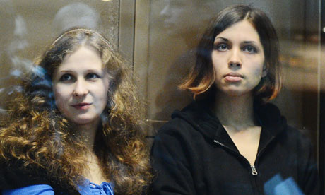
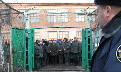
I choose the following article about the Pussy Riot, two of them have been sentenced for two years into Russian labour camps(the rest have fled and one was freed), for their protest inside of a cathedral against Vladimir Putin.
"The conditions in Russian penal colonies are considered a vast improvement over the Soviet-era Gulag system, the massive network of forced labor camps run by Stalinist secret police, which exposed inmates to crushing physical work, starvation, and bitter cold. Inmates now work a regulated eight hours, and usually at non-physical labor, like sewing. They receive a small salary for their work, with which they can buy food, cigarettes, and toiletries. Food and sanitary conditions are theoretically regulated by the state. But former prisoners and rights activists say that inmates are still subjected to unhealthy conditions, a complete absence of privacy, and a brutal social hierarchy in which younger or more vulnerable convicts are subject to harassment, abuse, and even rape by prison guards or other inmates."
'Daddy, what did YOU do in the Great War?' - Savile Lumley (1915)
'The "Uncle Sam" Range' - Schuacher & Ettlinger (1876)
The two posters sell an aspirational lifestyle unlike one
another (In culture and attitudes), yet both use and play on the methods of
selling this lifestyle in ways which are very similar.
The lifestyle being sold by the ‘Uncle Sam’s Range’ is the ‘American
dream’; prosperity and success.Everything
that the middle-class American aspires to is advertised here, apart from how
the range functions. The connotations that come along with the range are of
patriotism and wealth, this is indicated by over the top stars and stripes,
representative of the American flag. This then ties in with the attitudes drawn
upon in Lumley’s poster with small differences. Lumley draws more upon guilt to
inspire patriotism and a better lifestyle. They’re both very stereotypical and
play on that, they just utilise it in different ways: ‘Uncle Sam’s range’ is in
your face, full force American. Whereas in Lumley’s poster, it’s a play on the subconscious,
it’s subtle. Yet its effect is at core trying to influence you to be patriotic
and play your part in the war. That’s incredibly British. It’s the combination
of pressure and guilt that is within the poster that makes the audience want to
aspire to have a better lifestyle.
The attitudes displayed in both posters towards the audience
is very different too, In Lumley’s poster the audience is been judged, guilty
of not participating in the ‘Great war’ it’s a flash-forward looking in the
retrospect. This, and the fact that the
little girl is reading what looks like a history book of Britain's victory at war,
along with the little boy reenact what his daddy did during the war, it’s a complacent
assumption. It’s this is significantly
different to the ‘Uncle Sam’s Range’ poster which judges the world through
stereotypes. America has only been independent for 100 years yet it is already
superior to all other countries, seen from the racist options on the menu. It’s
America and the world and this is more than evident within the imagery with the
world the opposite side to America.
The wording as well suggests America’s power: “Feeding the
world by the aid of…” It’s an arrogant self-imposition that they’re the ones
feeding the world with this new range, or well ‘aiding’.This self-importance is similar to the slogan
in Lumley’s poster: “Daddy, what did YOU
do in the Great War?” on that aspect it’s the self-importance of an object and
person and who it’s aimed at. Although Lumley’s is a lot more personal and
direct, the italic, capitalised and underline score this perfectly.It’s a direct, whereas the range is simply
stating how great it is. The heading comes off as over the top, the gold text
relating to the wealth held by America is just another power and status symbol,
along with the eagle and black slave. There’s a strong contrast between the two
of them, Lumley’s being a lot more modest and realistic of a presumption of the
lifestyle attainable and to aspire to. It’s a middle-class aspiration, whereas ‘Uncle
Sam’s Range’ brings a superficial social status and power to the middle-class.
November 1917, the Bolsheviks overthrew the regime, they were the working class. No longer happy with the rule of the rich and elite Tsar. Lenin was their revolutionary, leader of the Russian SFSR. The below film depicts the invasion of the winter palace in Petrograd, it marks a crucial turning point in the revolution and Russian history. The film was produced to celebrate the revolution and victory, a decade later. [1927]
'Peace, Bread, Land'
With 80% illiteracy, visual communication was incredibly important, you can't spread a message if your audience can't read it. Visual communication became key to spreading the spirit. Red became a signifier for the 8 million dead and their blood spilt to bring about the revolution, and the victory over the tsar. A colour used throughout a lot of Russian iconography and on the flag. White became the colour of the the rich and the tsar. So below the working man carries the red flag through the buildings of the Petrograd where the buildings all covered in white. Red is the repression and the slain revolutionaries.
New start, new art. The Bolsheviks brought about new their own new identity and visual language, one suited for the working class. With a huge emphasis on symbolism key on their new visual language. It's uniquely Russian and speaks about their lives. From 3rd world to a new and culturally progressive powerhouse. Early Russian modernism, it displays the workers experience, in factories. It was mechanical and industrial, and incredibly unique.
Lenin encouraged the avant-garde artists to look west to artist's like: Picasso and Matisse, and to learn from them. Art in Russian was become geometric and industrial. It was organically developing into it's own style. This wouldn't have happened without the revolution.
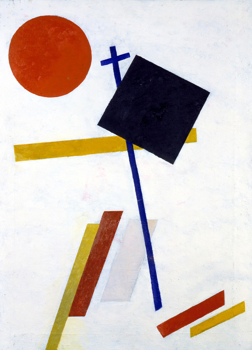
El Lissitzky - 'Beat the whites with the Red wedge'.
This poster marks the moment of revolution using pure visual communication. Representing the workers as the red wedge vanguard, and the elite as the white circle. A re-enactment of the storming of the winter palace in Petrograd.
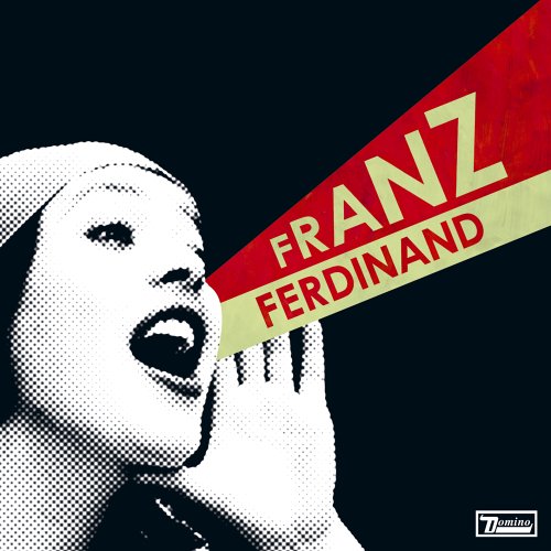
'Books' by Rodchenko was created to try and get people reading more by been placed outside of libarys. With no art market all design was been made to an agenda and have a purpose, one suited for the working class. Using common iconography, circle and wedge, subtly placed centre. 100 years old and still looking fresh, the influence the work been made still can be seen today. Example here been the cover for Franz Ferdinand's album cover, it's simple and has dated incredibly well. Also seen in the poster is the fact that it's a woman that's front and centre, the revolution was a leftist movement, socialistic and this is felt throughout the design and art.
Powerful and vocal iconography at it's best, another of Rodchenko's posters, here seen is Lenin building the new. The revolutionary himself, shown atop the wedge and circle, carrying infrastructure. Implying he's building the new on top of the old (the circle). The technique used was also revolutionary, photo-montage was a new thing, it was real and objective.
The aim of constructivists was 'of achieving the communistic expression of material structures'. ('The programme of the first working group of Constructivists' 1921 quoted in Lodder (1983) Russian Constructivism, London & Yale, p.94)
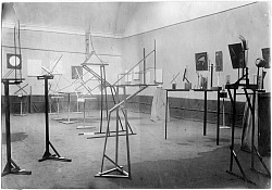
The constructivists also experimented with architecture, it was radical and new designs. Shown below is a test space for the new progressive designs rather then a exhibition of them. They were ambitious and where to show the true power of what Russia had become.