Wednesday, 30 April 2014
Slang & Dialect dictionary
http://freepages.genealogy.rootsweb.ancestry.com/~maureenmitchell/yorkshire/dialect_words.htm
http://www.webring.org/l/rdring=leedswebring;id=24;url=http%3A%2F%2Fyorkshirefolk%2Emyfineforum%2Eorg%2Farchive%2Fyorkshire-colloquialisms__o_t__t_74%2Ehtml
http://www.bbcamerica.com/mind-the-gap/2013/12/30/eight-yorkshire-sayings-will-baffle-americans/
Yorkshire:
http://www.visitmiddlesbrough.com/visitor-info/smogtionary-slang-dictionary
Middlesborough:
http://www.geordie.org.uk/
Geordie:
http://www.liverpoolecho.co.uk/news/liverpool-news/liverpool-sayings-top-26-things-6463028
http://thehouseofscouse.weebly.com/scouse-dictionaryslang.html
Scouse:
http://www.birminghammail.co.uk/lifestyle/50-top-birmingham-black-country-6477059
Brummie/ Black Country:
Poem Research
While In leeds I took the opportunity to do some primary research and see what Waterstones covered in terms of poems and how they represented in existing books and their pages.


There is an awful lot of gold foiling used within this section of books, on the front cover and on the spine. Certainty to enhance their perceived value, seen as though they're are just pages of poems. It's done to further the agenda that poems simply aren't a lower art form.

However with books like above, which make it look more accessible for the working class by making it look simpler and stand out with the colour hierarchy and block text. Here is a book that is devoid of any gold foiling or decoration with it's main purpose to educate how to understand poems. It's audience is clear and voiced very clearly.
While below there is two contrasting book covers for Lord byron's poems, one incredibly greek looking decorated book with the other a plain penguin classics book. The plain penguin book being accessible with a portrait of Lord Byron. While the other is something you'd buy to look nice on your coffee table. It is a lovely book cover none the less, but it illustrates Lord Byron's poems a lot more then the penguin. In doing so it gives it a more luxurious feel rather then a simple anthology of poems does. More personal and what not.


Almost all of the pages of the poem books, where all rather plain, even in the decorative books. They have a more consideration put into the front cover then the actual contents. Although, yes they are set out nicely, they could be a bit more creative with it.


There really is an awful lot of foiling going on with these books. It's like every other book has it.

Foiling.

Foiling.

Foiling.

Foiling.

Foiling.
(Although not a Poem book, I still really like the decoration on this book, would be very fitting within the Poem section.)

Foiling.


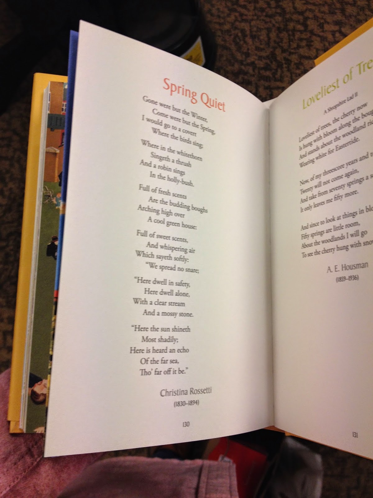
This was probably one of the nicest laid out poem books internally, pictures to compliment the poems, big coloured poem titles. The lot. It enhance the poem a lot more then been surrounded by multiple other poems.

As well as having their own chapter pages.


Black Foiling.

Not sure if the above was a poem book, but the cover of this book is really convincing.
Not poem books, but these were all interesting in their own right. Penguins Shorts. The calligraphy lettering here is used to a really great effect coupled with embossing, a lot of work into such a little book.


Tuesday, 29 April 2014
19th Century Literature
https://www.goodreads.com/shelf/show/19th-century-literature
http://www.goodreads.com/book/show/10210.Jane_Eyrehttp://www.goodreads.com/book/show/6185.Wuthering_Heights
http://www.goodreads.com/book/show/1885.Pride_and_Prejudice
I looked up the top quotes from Wuthering Heights to see what I could work with, however, from finding someones list of their top ten quotes from it, which seemed to be rather universal elsewhere. The quotes them selves are all rather uninspiring and require background knowledge into what they mean. Which is disappointing.
1) I've no more business to marry Edgar Linton than I have to be in heaven; and if the wicked man in there had not brought Heathcliff so low, I shouldn't have thought of it. It would degrade me to marry Heathcliff now; so he shall never know how I love him; and that, not because he's handsome, Nelly, but because he's more myself than I am (86). Catherine admits to Ellen that she loves Heathcliff but cannot think of marrying him because he has been degraded by Hindley. Heathcliff hears this speech, and he leaves Wuthering Heights, not to return for three years.
2) Nelly, I see now, you think me a selfish wretch; but did it never strike you that if Heathcliff and I married we should be beggars? whereas, if I marry Linton, I can aid Heathcliff to rise, and place him out of my brother's power? (87). Catherine tells Ellen what she believes will happen with her marriage and her relationship to Heathcliff. She really believes that her marriage to Linton will end up helping Heathcliff, which of course it does not.
3) My love for Linton is like the foliage in the woods; time will change it, I'm well aware, as winter changes the trees. My love for Heathcliff resembles the eternal rocks beneath--a source of little visible delight, but necessary. Nelly, I am Heathcliff! He's always, always in my mind--not as a pleasure, any more than I am always a pleasure to myself, but as my own being (88). The extent of the love between Catherine and Heathcliff is shown here. Heathcliff says similar things throughout the novel.
https://uk.answers.yahoo.com/question/index?qid=20080809103942AAhfcVx
Wednesday, 23 April 2014
Top 50 (Golden Age of American Animation). Studio brief 2
The Main List:
- "What's Opera, Doc?" – Chuck Jones, Warner Bros., 1957
- "Duck Amuck" – Chuck Jones, Warner Bros., 1953
- "The Band Concert" – Wilfred Jackson, Disney, 1935
- "Duck Dodgers in the 24½th Century" – Chuck Jones, Warner Bros., 1953
- "One Froggy Evening" – Chuck Jones, Warner Bros., 1955
- "Gertie the Dinosaur" – Winsor McCay, 1914
- "Red Hot Riding Hood" – Tex Avery, Metro-Goldwyn-Mayer, 1943
- "Porky in Wackyland" – Bob Clampett, Warner Bros., 1938
- "Gerald McBoing-Boing" – Robert Cannon, UPA (Columbia Pictures), 1951
- "King Size Canary" – Tex Avery, Metro-Goldwyn-Mayer, 1947
- "Three Little Pigs" – Burt Gillett, Disney, 1933
- "Rabbit of Seville" – Chuck Jones, Warner Bros., 1950
- "Steamboat Willie" – Ub Iwerks, Disney, 1928
- "The Old Mill" – Wilfred Jackson and Graham Heid, Disney, 1937
- "Bad Luck Blackie" – Tex Avery, Metro-Goldwyn-Mayer, 1949
- "The Great Piggy Bank Robbery" – Bob Clampett, Warner Bros., 1946
- "Popeye the Sailor Meets Sindbad the Sailor" – Dave Fleischer, Fleischer Studios, 1936
- "The Skeleton Dance" – Ub Iwerks, Disney, 1929
- "Snow White" (The Betty Boop version) – Dave Fleischer, Fleischer Studios, 1933
- "Minnie the Moocher" – Dave Fleischer, Fleischer Studios, 1932
- "Coal Black and de Sebben Dwarfs" – Bob Clampett, Warner Bros., 1943
- "Der Fuehrers Face" – Jack Kinney, Disney, 1943
- "Little Rural Riding Hood" – Tex Avery, Metro-Goldwyn-Mayer, 1949
- "The Tell-Tale Heart" – Ted Parmelee, Columbia Cartoons, 1953
- "The Big Snit" – Richard Condie, National Film Board Of Canada, 1985
- "Brave Little Tailor" – Burt Gillett, Disney, 1938
- "Clock Cleaners" – Ben Sharpsteen, Disney, 1937
- "Northwest Hounded Police" – Tex Avery, Metro-Goldwyn-Mayer, 1946
- "Adventures In Music: Toot, Whistle, Plunk and Boom" – Charles Nicholls and Ward Kimball, Disney, 1953
- "Rabbit Seasoning" – Chuck Jones, Warner Bros., 1952
- "The Scarlet Pumpernickel" – Chuck Jones, Warner Bros., 1950
- "The Cat Came Back" – Cordell Barker, Richard Condie (National Film Board Of Canada), 1988
- "The Mad Scientist" aka "Superman" – Dave Fleischer, Fleischer Studios, 1941
- "You Ought to Be in Pictures" – Friz Freleng, Warner Bros., 1940
- "Ali Baba Bunny" – Chuck Jones, Warner Bros., 1957
- "Feed the Kitty" – Chuck Jones, Warner Bros., 1952
- "Bimbo's Initiation" – Dave Fleischer, Fleischer Studios, 1931
- "Bambi Meets Godzilla" – Marv Newland, 1969
- "Little Red Riding Rabbit" – Friz Freleng, Warner Bros., 1944
- "Peace on Earth" – Hugh Harman and Rudolf Ising, Metro-Goldwyn-Mayer, 1939
- "Rooty Toot Toot" – John Hubley, Columbia Cartoons, 1953
- "The Cat Concerto" – William Hanna and Joe Barbera, Metro-Goldwyn-Mayer, 1946
- "Woody Woodpecker: The Barber of Seville" – James "Shamus" Culhane, Walter Lantz, 1944
- "The Man Who Planted Trees" (L'homme qui plantait des arbres) – Frédéric Back, 1987
- "Book Revue" – Bob Clampett, Warner Bros., 1946
- "Quasi At The Quackadero" – Sally Cruikshank, 1975
- "A Corny Concerto" – Bob Clampett, Warner Bros., 1943
- "The Unicorn in the Garden" – William T. Hurtz, Columbia Cartoons, 1953
- "The Dover Boys at Pimento University or the Rivals of Roquefort Hall" – Chuck Jones, Warner Bros., 1942
- "Felix In Hollywood" – Otto Messmer, 1923
http://tvtropes.org/pmwiki/pmwiki.php/Main/The50GreatestCartoons
Tuesday, 22 April 2014
All the Cartoon Festivals
http://www.digitalartsonline.co.uk/features/motion-graphics/monsters-university-behind-scenes-from-sketchbook-screen/
http://wfac.ca/
http://en.wikipedia.org/wiki/List_of_international_animation_festivals
http://www.justdisney.com/animation/animation.html
http://www.liaf.org.uk/events/the-festival/
http://www.miaf.net/
http://www.annecy.org/home
http://www.encounters-festival.org.uk/
http://www.animationfestival.ca/
https://www.sundance.org/festival/
http://www.sundance-london.com/
https://www.behance.net/gallery/ARCHITECTUUR-FILM-FESTIVAL-ROTTERDAM/15733977
https://www.behance.net/gallery/Poster-EMUS-Electronic-Music-Festival/8372463
https://www.behance.net/gallery/Brochure-EMUS-Electronic-Music-Festival/8771225
https://www.behance.net/gallery/EDEN-Festival-de-folk-psicodlico/14396159
http://www.mcmcomiccon.com/london/
https://www.behance.net/gallery/Waxeye-2014/15592499
http://www.leedsfilm.com/
http://en.wikipedia.org/wiki/Traditional_animation#Cels
http://en.wikipedia.org/wiki/Golden_age_of_American_animation
https://www.behance.net/gallery/The-Makioka-Sisters/3285018
https://www.behance.net/gallery/Distant-Light/14793803
http://en.wikipedia.org/wiki/Disney_Renaissance
http://tvtropes.org/pmwiki/pmwiki.php/Main/LimitedAnimation
http://tvtropes.org/pmwiki/pmwiki.php/Main/The50GreatestCartoons
http://en.wikipedia.org/wiki/Silly_Symphonies
Mickey Mouse, Bugs Bunny, Donald Duck, Daffy Duck,Popeye, Tom and Jerry, Betty Boop, Woody Woodpecker, Felix the Cat, Oswald the lucky rabbit, Pluto, Popeye
http://en.wikipedia.org/wiki/Lady_and_the_Tramp
http://en.wikipedia.org/wiki/Bambi
http://en.wikipedia.org/wiki/Sleeping_Beauty_(1959)
Walt Disney's first films: Snow White and the Seven Dwarfs, Pinocchio, Fantasia, Dumbo and Bambi.
http://cacb.wordpress.com/category/model-sheets/
http://en.wikipedia.org/wiki/Golden_age_(metaphor)
Wednesday, 16 April 2014
A Few Good Men Poster, Current
I looked into what the current posters where that existed for A Few Good men already, I found out it was a play as well as the film my movie poster is to be made of.
The posters all have one thing in common, mostly: The american flag, or colours of it represented throughout the image, The hammer and gavel, something patriotic to america, Naval officer.
This is pretty interesting, from watching the film as well. They've picked what I would suggest is the ONLY real visual imagery from the film funnily enough. These are really the only main elements that you could pick out of the film to identity it immediately.


Subscribe to:
Posts (Atom)