For the illustration style I'm not really too sure how I really want it to truly look yet, however I do know I want it to be something rather simplistic, simplistic enough that it still allows me to convey, emotion, narrative and the message of the moral. All the while been captivating enough for children.
The following illustrations are ones that caught my eye, in relation to these ideas of what I'm wanting to achieve when I illustrate it for my self. -
The following images and sources can be found at:
The below although really complicated due to being a paper craft uses colour really effectively as well as shadow to pull out the objects from the background paper.
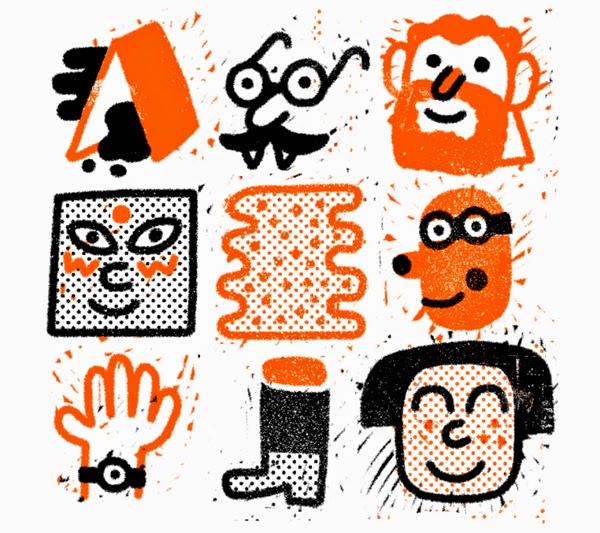
I really love the expressions of the faces of the characters here, they really express a lot of emotion all the while providing very little in terms of detail. This is the sort of look I would really like to use with my illustrations. Minimal but expressing a lot.
The use of colour here is what caught my attention initially, but I really like the dirtied look around the sides of the silhouette, however I do not think it would be totally appropriate for doing this for a child's book. The bright colours maybe, however I doubt I would be able to achieve these colours through printing methods which are easily reproducible.
The below, which uses pop-up as a method to create dimension to a scene really grabs your attention with it's very eastern european use of colour and aesthetic. It is this way of illustrating that I really like the most, it's concise and best of all it is ideal for reproducing quickly.
This illustration below I found to be really enchanting, I think the use of texture really helps bring it to life, although it's not just that, the colours really work so well together, the trees especially look so good. Although I'd love to create something with such fidelity as this, I don't see it happening due to the time it would need to create something like this.


No comments:
Post a Comment