I wanted to create a resource of images and for inspiration as extension to my current ideas so I could attempt to develop them further. Including examples of things I've found in book stores and in my flat.


http://www.designbypraline.com/recent/image/c/74/p/140/i/2353/
I found this book to be a wonderful example of the type of book I'm wanting to create, slightly too elegant but precisely the formant I'm after. Hard back and front, with a open spine. I'm interested in how to write on the side of spines but I'm not quite sure what to search for or how to do it as it seems an awfully fiddly thing to measure out.


http://www.designbypraline.com/recent/image/c/66/p/126/i/2106/
http://www.myfonts.com/person/Heinz_Hoffmann/
I discovered this book in Waterstones and had to purchase it, It just stood out from the book shelf so much with the use of the fluorescent ink. I'd really like the idea of using fluorescent ink to stand out, It's just what range of colours can I use and how do they react on different coloured papers? I also really want to use the typeface they've used for the titles in this book, it's called Block by Heinz Hoffmann, it's just a shame it's like £300.

http://www.designbypraline.com/recent/image/c/83/p/151/i/2779/
Another from Praline, they seem to have a thing with creating books with no spines, It's great though because they're one of the few to do it really well. They've used multicoloured spines here to separate the information inside the book, I'd find the idea of doing this a lot easier then doing the title on the side but it also means I'd have to carefully choose my spine colours to match the fabric of the board pieces.


http://www.behance.net/gallery/Benham-Reeves-Brochure/8951579
I found this brochure to be real clever, it's clever use of type and shape are really engaging when looking through the pictures, the page layouts are all really throughout and effective, as well as the combination of yellow, white and navy blue.

http://www.behance.net/gallery/Allegheny-Financial/3085155
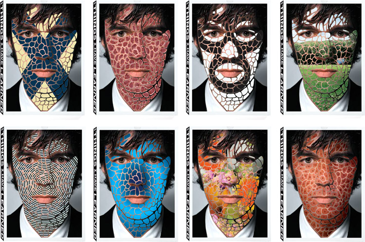
Sagmeister & Walsh: Things I've learned in my life so far
Really great use of interactivity with the packaging and books.
Really great use of interactivity with the packaging and books.


Lovely use of colours and a great aesthetic, older version is a lot more on point and nails the cold war theme of classification and military documentation. Interesting layout

Great use of layout and colour
http://www.behance.net/gallery/Le-Quartanier-Srie-Nova/11969043


http://www.behance.net/gallery/Block-Party/11839795


http://www.behance.net/gallery/15115-15-Years-115-Projects-Book/9043067

http://www.behance.net/gallery/I-Love-DIN/1277055

http://www.behance.net/gallery/Emergency-Congress/4215423


http://www.designbypraline.com/recent/project/c/78/p/145/


http://www.behance.net/gallery/Feeling-the-Flow-chart/11281127

http://www.behance.net/gallery/Harley-Davidson-Damage-Control-Flow-Chart/4678591


http://www.designbypraline.com/recent/image/c/53/p/108/i/1470/

Love the use of the different spine colours.
http://www.behance.net/gallery/Hey-Characters/8946663


I love how in the watchmen comic the front and back is a complete title. I like the fill text like this, they executed it really well here.


I wonder how the spine is bound like this? I would love to find out.

Great use of type, as an all type cover it's still very interesting.


Dazzling use complimentary colours used to great effect with block colours.
http://www.behance.net/gallery/ArtFad-2013/10898891
No comments:
Post a Comment