I’m sure you will have heard of CMYK before if you’re even in the slightest interested in print, which from reading this I will assume you are.
CMYK (Cyan, Magenta, Yellow, Key*) are the 4 different inks used in the process of printing, you’ll find them easily within your standard ink jet printer and in a laser printer. These inks are used on a much larger scale than these but using different processes (half toning) to create similar products.
The reason CMYK is used is because the 3 colours CMY overlay one another they create gray/black, adding the K on top solidifies and strengthens the black tones within an image. This is ink is subtractive, the more you add the more colour is ‘subtracted’ hence why it leads to black, theoretically.
*You’re probably thinking ‘What’s key?’ Well, ‘key’ is the called that because it is the key plate in printing (The plate that Is used to align the other colours), because in industry large-scale printing, plates are used, also because B stands for blue already.

While CMYK is ink and pigment based, RGB on the other hand is light based. Red, green and blue are the colours we see in everyday life, people who are colour blind lack one of these colours.
However, how does all relate to print? In a way it doesn’t, you just need to be aware of it when you do come to print. RGB has a much bigger range of colours available then ink does when printed, mostly because there are more colours in light that are reproducible.
This has consequences when you have an image that you are working with that is set to RGB, when you go to print that piece of work, if there exists any colours that are outside of the colour range of CMYK the image you are creating will appear duller.
Although it’s minor, obviously it’s something you need to always consider and be aware of when it comes to printing.
However, RGB does have its uses but there not for print, they’re for screens and light based media. RGB takes form in pixels in
monitors and within your smart phone screen.

Pantone is a colour matching system for matching up the colours you want to print to the colours that are represented within programs that utilise Pantone colour matching systems within them.
For example: Adobe’s creative suite features such swatches within most of their programs.
This is used then by printer who sees which Pantone colour you has specified and then is able to mix together those inks specifically to print. So instead of having to have 4 colour CMYK you can have the colour as a spot colour and save your self the cost of using 4 plates. This works out a lot cheaper if you only needing to print one colour in a run of things.
Sometimes there are colours that you can’t create with CMYK, for example: Fluorescent colours. These are inks that can’t be recreated within the spectrum of CMYK printing and are considered Spot Colours, or they can be used in the way specified above using Pantone.
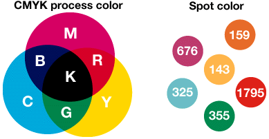
Spot colours are colours created for single run prints that can be combined with CMYK as a 5th colour or simply used alone.
No comments:
Post a Comment