A collection of branding and collateral collected for inspiration, some that are good some not so. I wanted to see a big range of different things created and how far other designers have taken their briefs.


Misc collateral, I really like the envelopes here, they've made good use of the space on both sides. The rubbers are a good touch too.

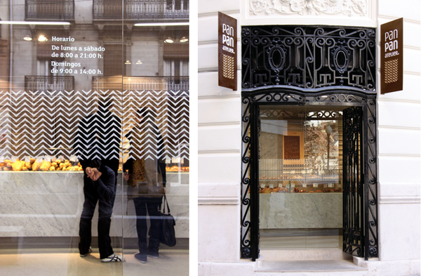
Great use of a pattern on the window graphic, I really like this. It's very sleek and modern. For a bakery it does look high class but it feels accessible for lower markets.
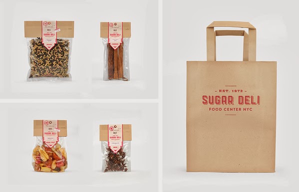
Simple bag mock-up and herbal bags, The use of the consistent material in theses is impressive, brown paper everywhere it's surprising how many uses it has.


I love the wrap here, I'm curious to how they folded it up to be able to have the sticker there but it works really well. The pasta salad as well looks really good. I like how they've managed to have the sticker always positioned to be coming from the top on everything.

Stamp on a bag, that's new! Although it seems rather logical to do this, it'd save lot in printing costs.


Simple business card well executed to fit all the details on like that in such a effective manner.


Very clean brown bag design, the sticker really seals it all together. Love how they've managed to merge the arabic and english together for the logo. It's deceivingly great.


Lovely use of a pattern on a book cover. Looks like leather?


Really great branding, it looks arabic, not because of the use of the text but the packaging styling too. The patterns bringing it home too, It's a lovely collection of collateral and brilliantly designed. It all stands out from each and one another while the patterns compliment the brown.

Great use of pattern to achieve a consistent branding, It works really well on all the applications they put it on, bags, wrapping. The typography work too, It use of the different weights makes the words roll of your tongue really easily.


The simple graphics here are really loveable, it brings across a rather friendly home tone with it, not because of the houses but simply because of the use of shape and the miniaturisation.


Use of branding on a pizza box, They stand out through the use of the rather strong vivid red, It's effective to say the least and although I'm not sure what it says. It by and half works it well.


I'm not to keen on the logo for this one, however the pattern and the packaging look awfully good. The burger looks delicious. The pattern completes these however and the use of colour.

No comments:
Post a Comment