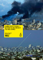
Carrying on from the research from the previous post, I wanted to look further into work created for human rights. I wanted to see the style used and the way in which they try and convey their messages. From what I've seen they're straight to the point without been to blunt and in your face. The messages are clear and effective. Yellow seems to be the running colour throughout the branding of the posters along with a slight hint of blue, yellow been the attention getter colour for the posters and the issue. An example of this would be the poster created by Picasso, on the second row here on the right. It uses yellow on the area it's wanting to draw your attention to the issue. They're really effective posters.
Choose to look into constructivism work, although it would seem the only link to apply this with by would be that it's just in Russia. The link I'm trying to draw is with the bolshevik revolution, I'm wanting to pull in ties with that and what currently going on in the country using the artwork as a voice for that.


No comments:
Post a Comment